For me, print is where my design career began. Over my career I’ve worked on what seems like every print project imaginable – small projects like quick-turn one-sheets, postcards, posters, bookmarks, all the way up to large projects like multi-book catalogs, cohesive marketing collateral systems, and advertising campaigns. With a highly adaptable style and the unique point-of-view of an in-house designer, no matter what the project I am the perfect partner in creating eye-catching, memorable marketing pieces.
NAVTA Journal
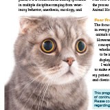
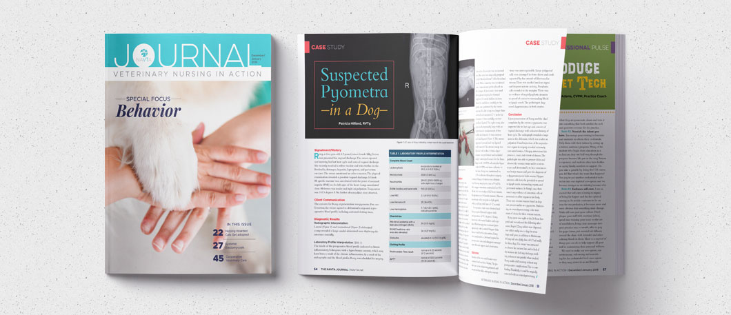
In the fall of 2017 I was hired to completely redesign the NAVTA Journal, a trade journal for the The National Association of Veterinary Technicians in America. I refreshed the overall typography with a friendly, rounded font for body copy paired with a very open sans-serif for headings, etc. A color-coded, tabbed design helps guide readers to desired sections. The magazine 64-pages and comes out bi-monthly.

IAAO Awards Luncheon Program
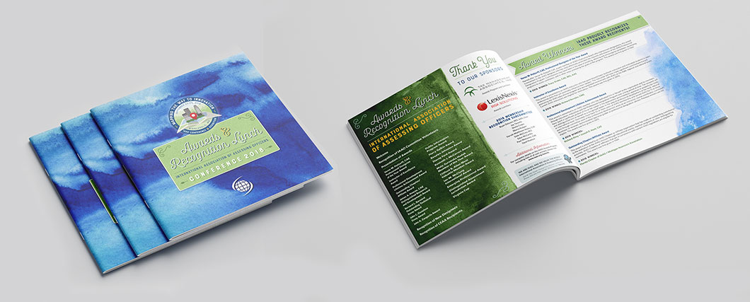
I designed this program for the International Association of Assessing Officers's Conference 2018 Award Luncheon. The overall design for the conference was kind of woodsy and naturalistic, so I used this beautiful watercolor as inspiration for the program, which needed to look nice enough to be a keepsake.

Blue Valley Academy Student Handbook
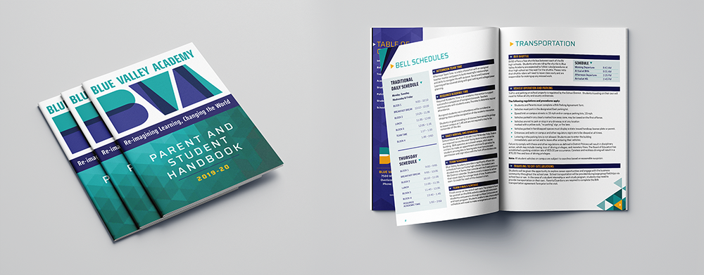
When the new principal of Blue Valley Academy (BVA) came to me, he was dealing with outdated and unattractive materials. Because it is a front-facing piece that all students and parents will see, we opted to update this piece first. I started with an interim new logo design based on abstract layered shapes, to invoke the idea that BVA students take abstract ideas and turn them into something new and concrete. I stuck with the existing BVA color story but elevated it to something more modern and fun. I also designed a PowerPoint template and letterhead to complement this design.

Boelte-Hall Bartle Hall Brochure
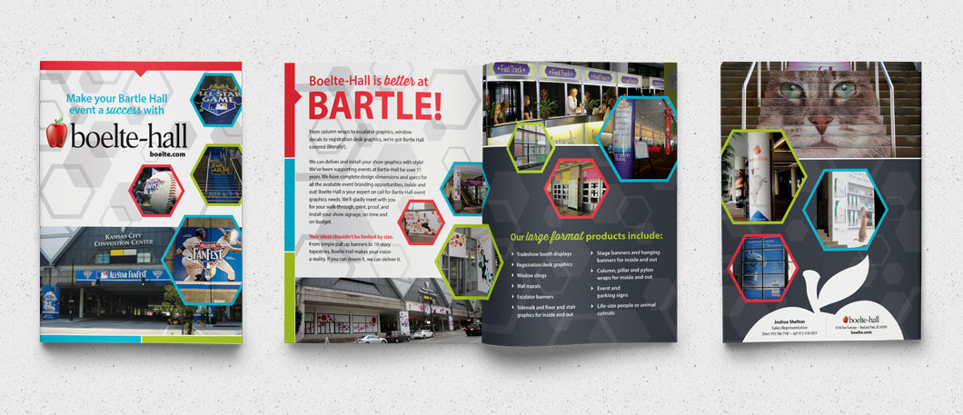
Boelte-Hall is a Kansas printer based in the Roeland Park area. They have a partnership with Bartle Hall, a leading location for conventions in downtown Kansas City. This brochure advertises their signage services for potential exhibitors. It utilizes their recent rebranding look, with a hexagonal pattern and bright color scheme.

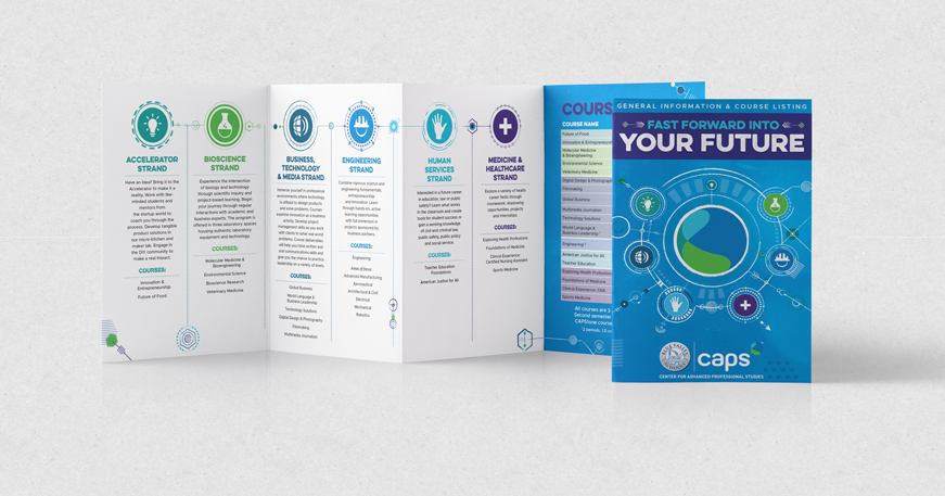
CAPS Course Gatefold Brochure
CAPS is a professional development program for the Blue Valley school district in Kansas. I did an initial redesign of their collateral when I first started working with them (See case study for that project here). Subsequently we simplified some of the collateral offerings and refreshed the look and feel with this design, which utilizes a lot of hand-drawn lines and abstract shapes paired with the existing iconography to keep the through-line of the original design. This design was iterated across all collateral.

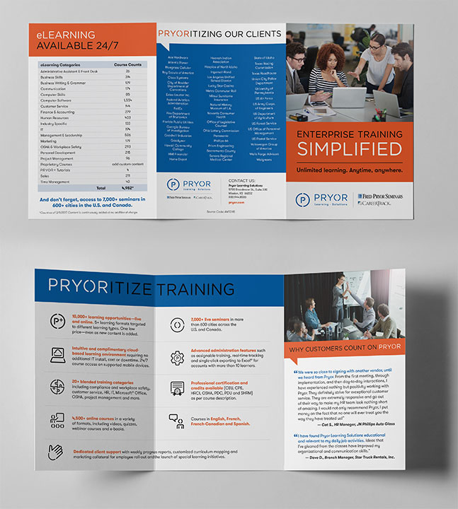
Pryor Learning Solutions e-Learning Trifold
I designed this trifold brochure for Pryor Learning Solutions. It's designed to promote the company's e-learning options, utilizing their recent brand update. Bold color blocks in their brand color story move the reader's eye to the most relevant information, with a clean design that makes it easy to digest. The brochure also include the Pryor custom-designed (by me) iconography.
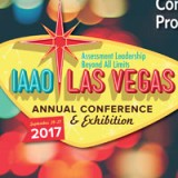
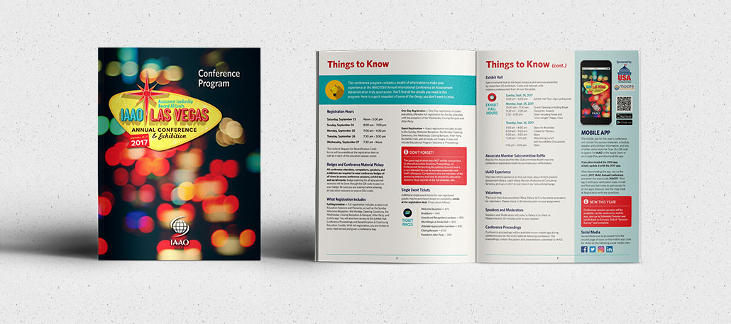
IAAO Las Vegas 2017 Conference Program
I designed this program for the International Association of Assessing Officers 2017 Conference, which took place in Las Vegas. The design is bright and clean, with colorful informational boxes and icons to draw readers' eyes and increase the usability of the program, which was much smaller, yet bulkier last year. The program also features a stitched-in center fold-out panel with the various maps conference attendees would need to navigate to the various conference events.

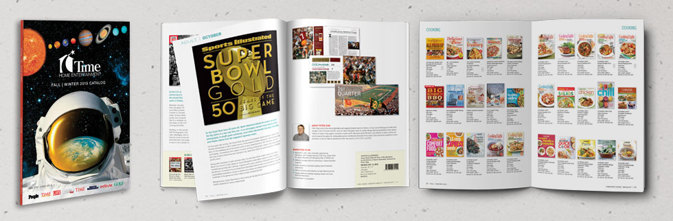
Time Home Entertainment, Inc. Book Catalogs
The biannual catalog for Time Home Entertainment, Inc./Oxmoor House features both new releases and a fairly lengthy backlist. For 2014, the catalog was redesigned to utilize the previous color scheme but a more compact layout that still gave generous space to point out special features for each title. This project took approximately six weeks from initial design to press files.

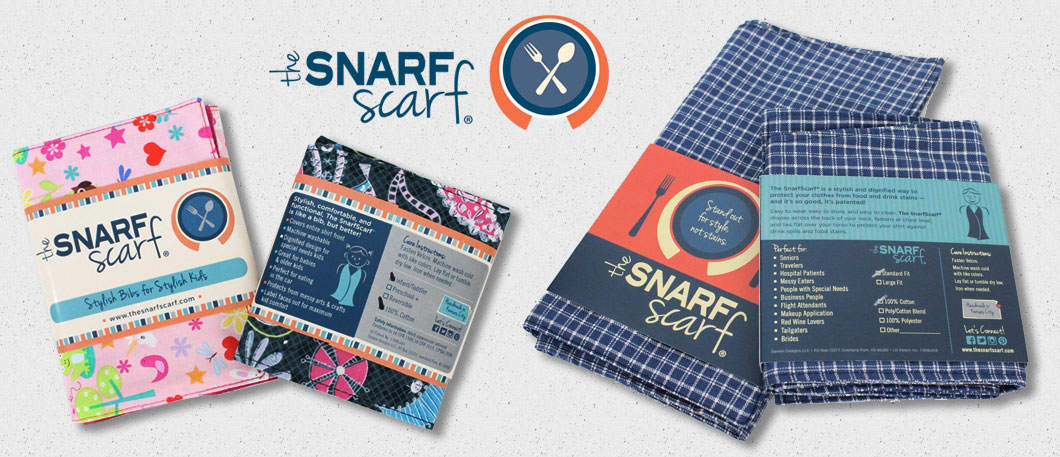
The Snarf Scarf Packaging
The Snarf Scarf is a handmade protective scarf that helps keep clothes clean from spills. There are scarfs for adults and children. While the logo was already designed, I designed a unique mark to complement that, and then designed packaging for both the adult and child versions. The adult sleeve is clean and modern, while the child one is more fun and whimsical, but they all complement one another.

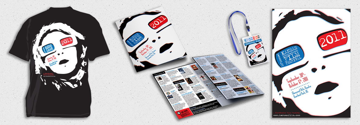
Kansas International Film Festival Marketing Collateral
Starting with the unique and graphic Kansas International Film Festival logo, I designed the 2010 poster to zoom in and really make the most of the stark shapes and colors in the identity. I then utilized the poster theme across all other collateral for the show, including t-shirt, festival passes, and the festival program.

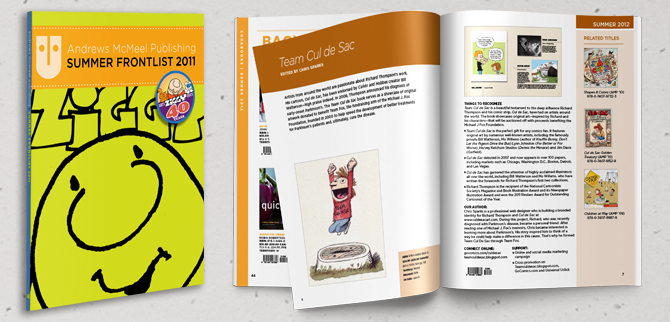
Andrews McMeel Publishing Book Catalogs
At the time I worked on this project, Andrews McMeel Publishing put out catalogs featuring new products three times a year — Spring, Summer, and Fall. Each season had several catalogs — Frontlist, Cookbook, Childrens, Gift, etc — all following the same design style. I worked on this project for over five years and it involved a lot of content management, quick work, and production know-how.
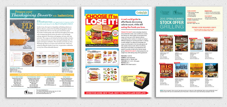
Time Home Entertainment, Inc. Sell Sheets
I often create quick-turn sell sheets for Time Home Entertainment, Inc.'s sales department. These sometimes promote a particular title or sales offer, etc. I design each one to complement the aesthetic of the books it is featuring, or to fit perfectly with the look of the catalog if the offer features a more diverse range of titles.
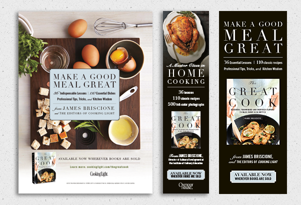
The Great Cook Print Ads
These print ads were designed for the Spring 2015 title The Great Cook. The client wanted something simple and sophisticated and supplied several image options. Each ad size required thinking of the design in a different way.

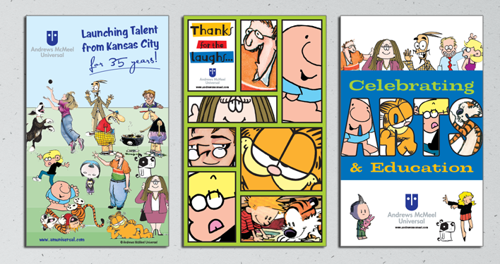
Andrews McMeel Publishing Pembroke Program Ads
The Pembroke Hill Playbill, which is distributed at all performing and visual arts events throughout the school year, raises income to fund children's arts programs throughout the year. This series of ads was placed by Andrews McMeel Universal and features the cartoons published by this company as both syndicated features and books. I wanted to emphasize the fun of the art but I needed to look at it in a new way every year. I think each ad stands on its own as a design but they all work together as a series as well.
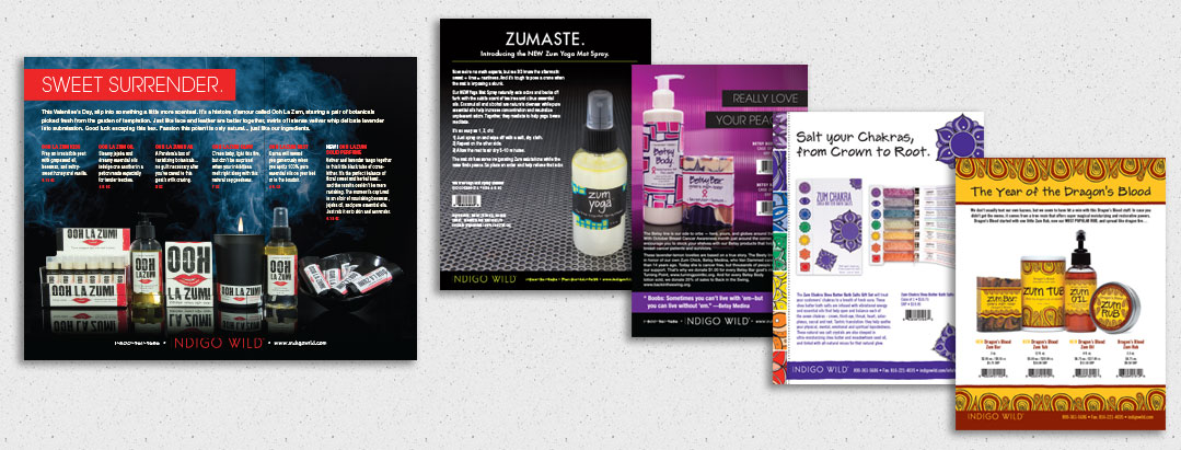
Indigo Wild Sell Sheets
Kansas City company Indigo Wild has a very distinctive and fun design aesthetic, but it is one that has grown and transformed in the six years I've been working with them. This is a selection of sell sheets from the last six years. The designs have gone from quirky and hand-drawn to a sexier, more streamlined look. As always I design my sell sheets to complement the existing aesthetic of the company, so these have been fun to tackle over the years.
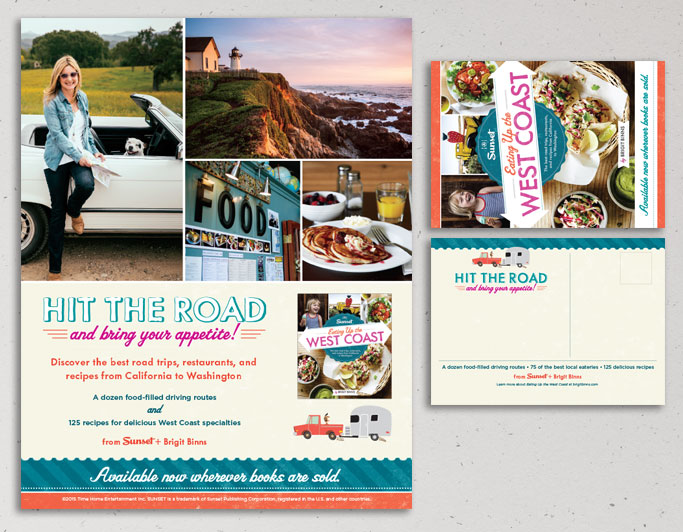
Eating Up the West Coast Print Ad / Postcard
This ad was created for Time Home Entertainment Inc for the spring 2015 book Eating Up the West Coast. It ran in Sunset magazine. The book is a kind of cookbook/travelogue based on a popular blog, so I chose to feature images of the author, who is a main selling point here, combined with a travel photo, a restaurant pic, and a food photo. The book design was really fun so I pulled several of those elements out to keep things light. To me this ad really encapsulates everything the book has to offer. I also designed a complementary promotional postcard for this title.
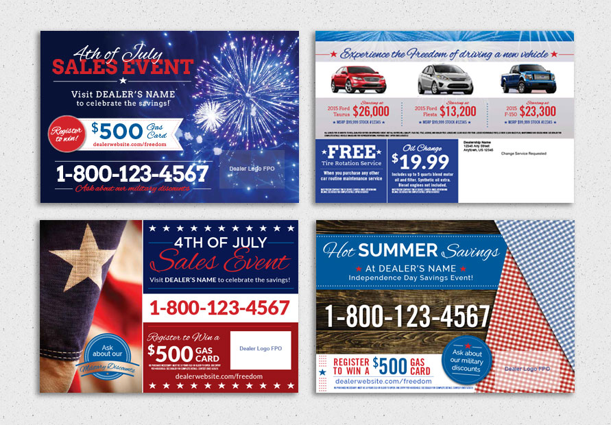
NextPage Independence Day Postcards
NextPage is a company offering a wide range of print services. For major holidays, they produce a series of promotional packages that they sell to car dealers. They came to be with a request for three Fourth of July "high end" postcard designs that were then extrapolated into handouts and web banner ads. I think these are fresh and modern looking but still hit the Independence Day notes.
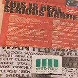
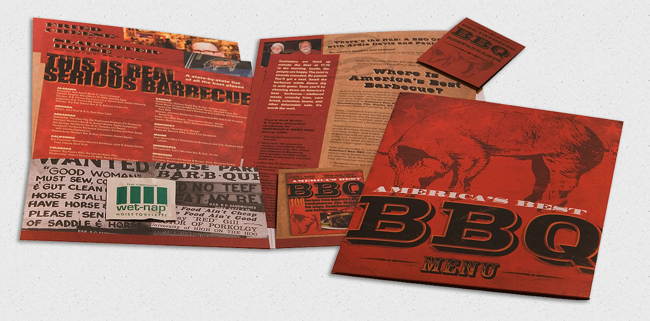
America's Best BBQ Press Kit
America's Best BBQ was written by Kansas City BBQ Grillmasters and published by a Kansas City publisher, so the press kit really needed to shine. I was lucky to have a really great book design to jump off of. I started with the a folder, which is the "menu", and the kit contains five pieces of collateral and a foldover bookmark. A wet nap sourced very cheaply from Amazon.com adds a fun touch that makes the kit really memorable. I've done a lot of press kits over the years, but this is really one of my all time favorites.