The International Association of Assessing Officers (IAAO) is an a professional organization for Assessing Officers, or the people who assess property values for cities, counties, and states both nationally and internationally. Each year, they hold a Conference and Exhibition for members that requires specific branding designed around the location. For 2018, initially, the only request from my direct client, IAAO’s Director of Marketing, was that the logo utilize a nautical design, to reference the beautiful nearby lakes in the host city, Minneapolis, MN. She also preferred logos that could be placed on any color background. Based on this brief, this was my initial logo submission:
As you can see, the nautical theme is front and center in each of these designs. Two of them are completely self-contained, making them very easy to place on any color background. The other two could be modified to work.
After this first round of designs were submitted to the IAAO director, it was determined that rather than nautical, the director would prefer something “outdoorsy,” and that there was a conference theme: “Mapping the Way to Innovation,” because a focus of the 2018 conference would be mapping technologies. With this in mind, here is my second round of designs:
Ultimately, C was the chosen design. It utilized mapping very explicitly, as well as combining the settings of city and nature, which is a focus of Minneapolis’s own branding. The emblem style of the logo makes it very easy to put on a variety of collateral and it’s relatively easy to read even at smaller sizes. I also versioned out the final approved logo to include a mostly typographical version for times when the illustration was not appropriate (such as embroidered t-shirts), and a speaker’s badge for speakers to use within their emails in the run-up to the conference.
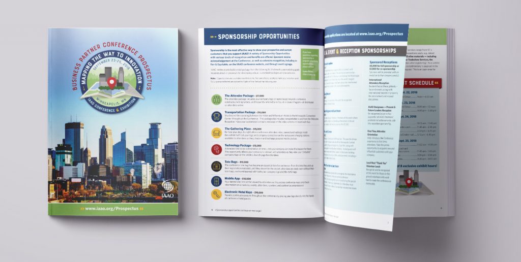
Once the branding had been approved for the conference, the next project was a prospectus to solicit exhibitors and sponsors. This 12-page brochure needed to reflect the conference theme but also was highly informational. It included an infographic to reflect historical attendance numbers for the conference and customized iconography for each sponsorship opportunity. The program of the conference looked nearly identical to this (but with different information, of course) so I’m not going to include an image of it here.
In the run-up to the conference my client requested signage and ran ads to promote the event. I designed a pull-up banner to be used at other events, as well as a full-page magazine ad to be used in their in-house magazine as well as other applications as needed.
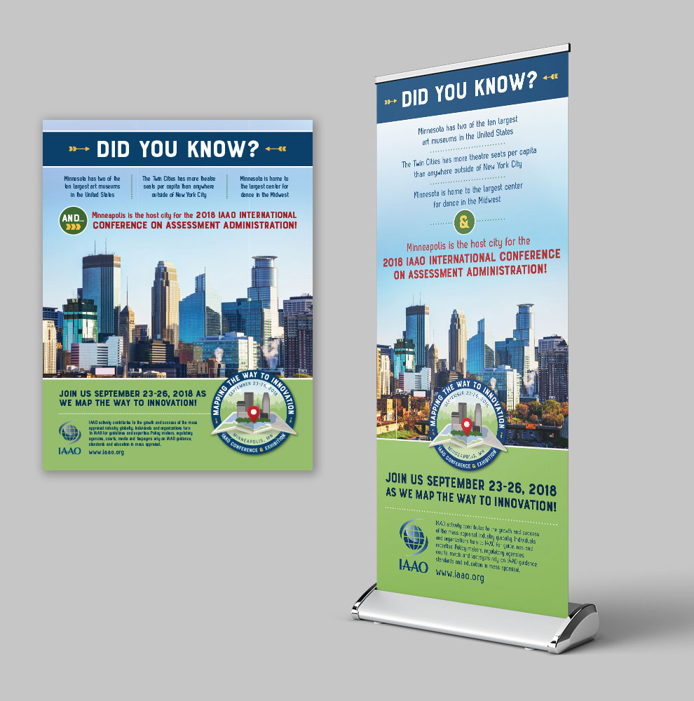
As you can see, once the identity was established, several elements were used consistently to establish a cohesive look. The color scheme of navy (which is already an IAAO brand color), paired with the earthy greens, mustard yellow, and a slightly deep red. Traditional campsite elements such as arrows were utilized throughout each piece to add flair and visual interest.
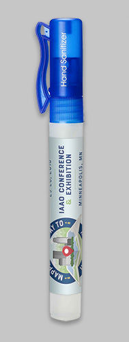
At the actual conference, the branding was further carried through conference swag, such as hand sanitizer and water bottles.
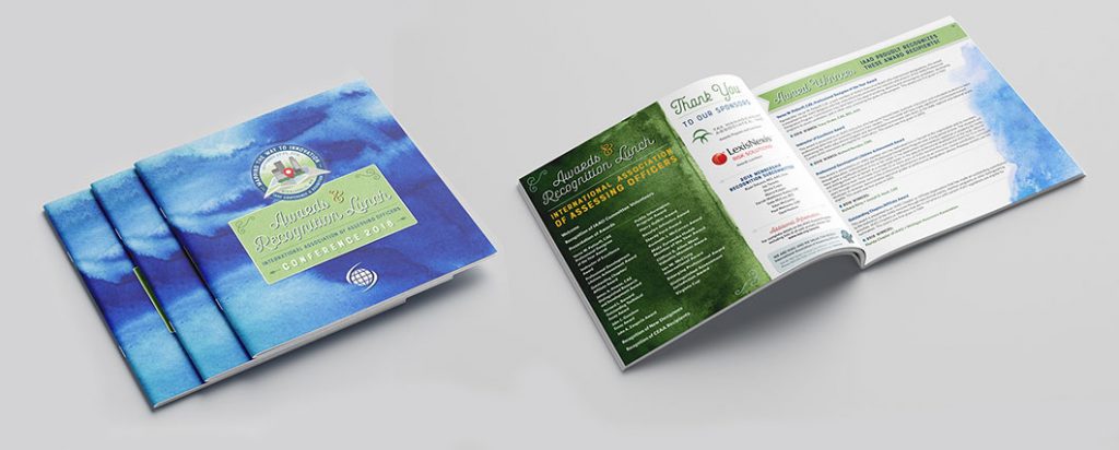
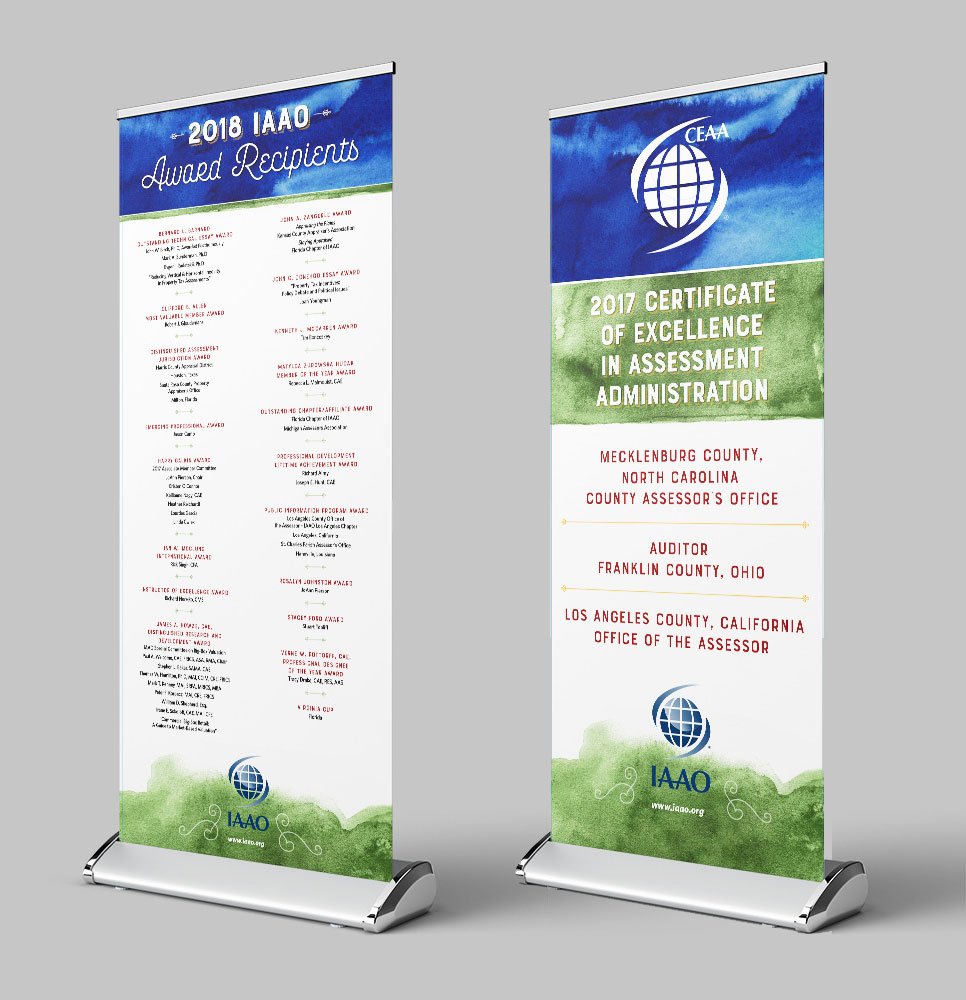
The last component to the design for this show concerned the awards banquet. The yearly awards banquet required a different, but complementary design, for both signage and a program that needed to look nice enough that it could be kept as a keepsake by award recipients.
For this design, I stayed with the same color story, but sourced this gorgeous watercolor art, which felt both special and worthy of an awards keepsake program. The organic quality of the art also felt really well suited to the naturalistic, outdoorsy theme of the conference.
Overall, my goal was to create a cohesive identity for the conference, and I believe that this goal was achieved. Through typography, color story, and auxiliary graphics, each item works together to build an unmistakable identity for conference attendees.