Branding and Identity
ACA Angel University
I created this logo for Angel Capital Association, a trade association for angel investors, to brand their education series. This branding is used both independently and tied in with their annual conference, the Summit. The brand invokes learning, with simple illustrations of books, placement of the books also represents bars on a bar graph, with upward growth indicating the growth of investments.
Prestige Transportation, LLC Identity
Prestige Transportation, LLC is a Kansas City-based company offering reliable and accessible high-end transportation services. The client wanted to first and foremost communicate class, so I designed this balancing the modern with the traditional, to be really graphic but still elegant. The business cards were printed on extra thick uncoated black stock with a beautiful mirror-shiny silver foil on the logo side.
IAAO Conference & Exhibitions
I create a yearly logo for the International Association of Assessing Officer's (IAAO) yearly conference. The design brief is that the logo needs to invoke the city in which it's being held, and also it needs to be a seal- or badge-like design so it's easy to use across many mediums.
Veterinary Nursing Initiative Logo
This logo was created for the Veterinary Nurse Initiative, which seeks to create a national "Registered Veterinary Nurse" credential to replace the various different Veterinary Technician credentials used throughout the country. The new title also codifies the unique role these professionals play in a veterinary practice. To that end, I designed this logo to invoke the professional partnership that leads to better outcomes for patients. The red cross represents the foundational role Veterinary Nurses play and the teal cross is the Veterinarian. The patient is protected between the two of them, and the two crosses create a stairstep up, symbolizing success. The design is crisp, clean, and professional and will help support the National Association of Veterinary Technicians as they pursue legislation to nationalize the Veterinary Nurse credential.
To learn more about this Initiative here.
To learn more about this Initiative here.
Prairie Pediatric Dentistry Identity
Prairie Pediatric Dentistry is a Lenexa, KS-based dental office serving children from ages 1 to 18. The client requested something clean and professional looking and was attracted to designs with curved lines. I created this custom wheat illustration in a style that invoked a child's drawing, and selected an easy-to-read, yet approachable font to create a welcoming feel to the identity. The blue, green, and gold color scheme were applied throuough the other materials, and I used the wheat illustration as an additional design detail on the referral pad.
Jews for Animals Logo
This logo was created for a group called Jews for Animals, an initiative from The Shamayim V'Aretz Institute. This organization focuses on the humane and ethical treatment of farm animals. They wanted a design that was clean and simple, so I created custom animal illustrations and then placed them within a circle that mimics the design of their existing logo, so that they can work harmoniously together. There are both horizontal and stacked versions of the logo for different applications.
Bushyhead, LLC Attorneys & Advisors Brand Identity
Bushyhead, LLC, Attorneys & Advisors is a small law firm based in Lee's Summit, MO. Because the firm has a focus on real estate law (their tagline is "Building Community"), I designed an abstracted, geometric city skyline paired with a slender, modern wordmark. The owner's favorite color is purple so I balanced that out with a nice grayish taupe tone to be colorful but still professional.
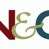
Nasteff & Quinn Attorneys & Advisors Identity
The attorneys of Nasteff & Quinn, who had previously been members of a different firm together, wanted something that was similar in style from their old firm's logo but that still stood on its own. I designed the mark to feel strong and grounded, but with an approachable, traditional ampersand to pull the initials together. The traditional but approachable serif font builds on the messages communicated by the mark. The three-color scheme feels modern but is also slightly muted and grounded, with the blue complementing the maroon and green nicely. I designed complementary business cards and letterhead to round out the identity.
Pet Nutrition Alliance Identity
Pet Nutrition Alliance is an organization whose mission is to position nutrition as essential to optimal pet health by providing resources to veterinary healthcare teams. They came to me wanting a more appealing logo for use in consumer-facing applications. The resulting design needed to be eye-catching and fun, and I think that brief was fulfilled. This logo is memorable and whimsical, but balanced by a professional, no-frills typography. I also designed complementary icons for use on their website.
Little Pumpkins Identity
Little Pumpkins, LLC, a company specializing in organic baby foods, came to me needing a clean and modern logo that still invoked the fun of babies. I illustrated this little guy and picked a fun bright green, orange, and brown color scheme. In addition to the logo I designed business cards, food labels, postcards, table signage, and a website.
Kodi's Cakes Identity
Kodi's Cakes is a small custom cakes business. The client wanted something clean and sophisticated while invoking the charm of an old-fashioned bakery, and I think this logo succeeds, while reflecting the personal style of the bakery's owner. I also designed a business card and a really fun website for this client.
James Dean Walker Law Identity
James Walker came to me requesting a "hip" logo that he could proudly display on the door of his new offices, located in a downtown building adjoining the Screenland Theatre. This logo and accompanying business card and letterhead was the result - clean and modern, but not overblown.
KC Restoration Identity
Sometimes, a client has a logo they like but it wasn't well executed. KC Restoration, LLC hired me to take their existing logo, which was overly complex and difficult to read at small sizes, and clean it up. The new version is brighter and crisper, and is much easier to use in a variety of applications. I then designed complementary business cards, letterhead, and collateral to utilize the new look across all pieces.
Brazill's on Main Identity
Brazill's on Main is an upscale casual restaurant located in a conservative county of New York. The interior is a really lovely brick, so I used that as a jumping-off point, pairing it with a saturated black. The serif font of "Brazill's" is conservative, but the script of "On Main" balances it out with an easy casual vibe. The menus are professionally printed but the beer lists and other items have been designed with a white border for easy in-house printing.
Garden Railyway Show Logos
This series of logos was designed for a client who organizes conventions for model train and garden railway aficionados. Each is a nice distillation of the locale rendered in a clean, graphic illustrative style.
Various Logos: Urban Simplicity, Caroline's Embroidery, and Country Club Plaza Apartments
This serious of logos is for a wide range of businesses - an interior design firm, a custom embroidery business, and an apartment complex - but they all are great examples of a clean, somewhat feminine logo style.
Various Logos: AdminJack, MJ's Lessons from Home, Reinvent1, and Rejuve-Nation
This serious of logos is for a wide range of businesses - a freelance administration specialist, a home-cooking teacher, a sports consultant, and a career-coaching service - but they all represent a very graphic, clean style.
Various Logos: TacticallyShop.com, 4GreenPaws.com, Cheerful Vintage, The 8-11 Club
This serious of logos is for a wide range of businesses - a military gear website, a pet supply website, a vintage goods shop, and a business club - but they all represent my graphic, clean logo design aesthetic.
Business-to-Business
Woodstream Preventing Workplace Harassment PowerPoint
IAAO Vision 2020 PowerPoint
Kansas City-based The International Association of Assessing Officers (IAAO) came to me needing a template designed for general presentations and a specific layout for their "2020 Vision" presentation. Using their brand colors of orange and blue as a starting point, I pulled an image of the Kansas City skyline and colorized it in their brand colors. Interior slides use an infographic-style icon scheme to illustrate individual points.
Hallier Reed Healthcare PowerPoint
I both designed and did all slide layout on this presentation for Hallier Reed, an independent insurance brokerage specializing in marketing and maintenance of employer and executive benefit programs. Focusing on the Affordable Care Act, the client used this presentation to advise client employees on the rules of the healthcare law. The color scheme keeps it on-brand while the icon design adds a bit of fun.
Laura and John Arnold Foundation PowerPoint
Pryor Learning Solutions XPO Logistics PowerPoint
Pryor Learning Solutions commissioned this PowerPoint as part of a sales pitch to XPO Logistics. The design utilized XPO's brand identity and colors, paired with the Pryor iconography and overall look.
NAVTA VMX Virtual Booth
VMX is a Continuing Education-based trade show for veterinary professionals. Due to the pandemic, the 2021 show was exclusively in a virtual format. I designed this booth for the National Association for Veterinary Technicians in America (NAVTA). It included four posters, a banner, a large backdrop poster, and podium signage. A detail view of the individual components can be viewed here.
Birch Communications Trade Show Booth
This trade show signage was done for Birch Communications. The booth had multiple components: a backdrop, header, shelving unit, and a standalone barracuda banner. They requested something abstract that would complement their existing brand look, and this was the end result: a cohesive trade show backdrop that fits right in with their materials.
Pryor Learning Solutions Trade Show Banners
When Pryor Learning Solutions refreshed their identity, they needed a new trade show booth and complementary banners. This set was designed to utilize the new color story through vibrant, bold color blocking, as well as the new iconography. They looked nice together but each also worked as a standalone piece.
NAVTA Snap Pop-Up Booth
This flexible Snap Pop-Up Booth was created for the National Association for Veterinary Technicians in America (NAVTA). This design is lightweight, modular, and allows for use of individual components in different configurations for ease of setup. It includes a large square, two small squares, a tall banner, and a podium wrap.
SCD Probiotics Trade Show Booth
Kansas City-based company SCD Probiotics wanted a trade show booth that felt light and natural but also gave a tech vibe. I used a really lovely repeating honeycomb pattern in various blues to achieve this, and then followed up with a mosquito banner utilizing the same pattern to complement the booth.
Source Maintenance Banners
These banners were created for Source Maintenance, a company specializing in corporate cleaning services. These were created to complement other marketing material updates, with a focus on unifying typography and repetition of the circle motif.
Advanstar Booth
This 7-panel trade show backdrop was created for Advanstar Communications. I used the modular marketing look they were using at the time to my advantage, so that booth setup would be easier and it would mask the panel seams. The white portions on the bottom are representative of a table with logo panels hanging on the front.


