Pop! Creative Design

Make a Statement.

  • Home
  • Portfolio
    • Logo / Identity
    • Print
    • B2B / PowerPoint / Signage
    • Web
    • Iconography & Infographics
    • Case Studies
      • Case Study: IAAO 2018 Conference Identity
      • Case Study: CAPS Collateral Redesign
  • About
  • Contact
  • Instagram
  • Facebook
  • LinkedIn

Case Study: CAPS Collateral Redesign

July 2, 2015 by edspickles

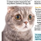
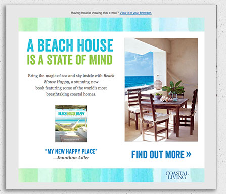
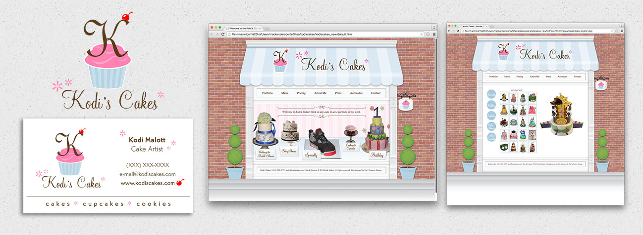
In 2015, a former client of mine started working with CAPS, or Center for Advanced Professional Studies, a specialized school program for high school students in Kansas’s Blue Valley school district. The old collateral had an early-nineties Apple default desktop look to it, with a lot of unattractive gradients and curvy lines. It felt stale, unattractive, and contrary to the goals of the CAPS program itself, which is innovative, forward-thinking, and focused on new technology.
CAPS Folder Before & After Redesign

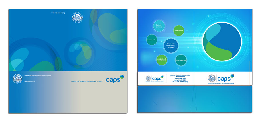
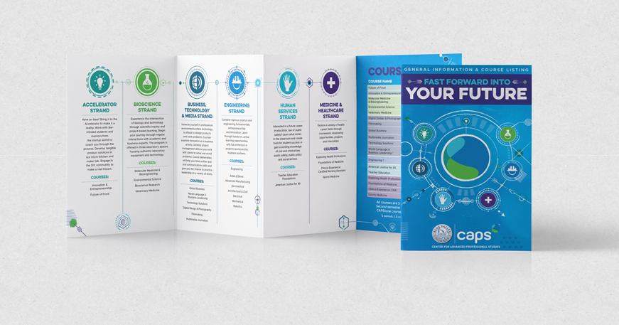
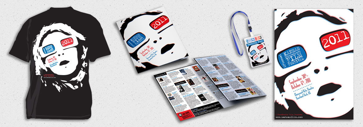
The first piece I redesigned, and the piece that served as a jumping-off point for the entire project, was a folder. The folder is used to distribute course information to prospective students, so it needed to be eye-catching enough to make someone want to look inside. I proposed three options: a circuitry theme, an icon theme, and the one that was selected, a high-tech design that invokes the idea of moving forward at high speeds, which is what this program lets students do in their education. (see right). You can see from the original the design problems I was confronting – they had a great idea in abstracting the logo, but here it just drifts and it doesn’t communicate anything about the nature of the program. My design is lighter and has a sense of energy and fun, with a richer, brighter blue and an avoidance of gray. Each course section, or “strand,” is featured prominently on the back of the folder.

CAPS Barracuda Banner

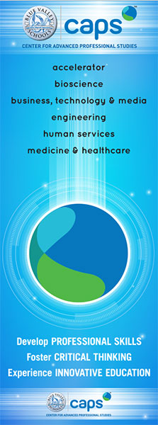
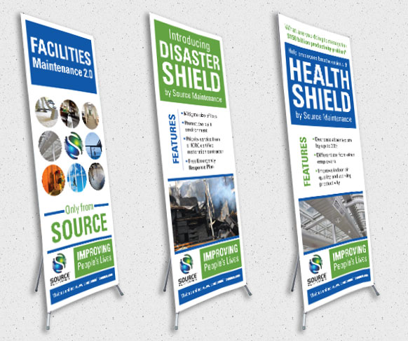
The next step was a Barracuda banner. The banner sits on an adjustable holder, so it can be shorter or taller as needed. This presented a challenge – the information needed to be designed in such a way that it would be OK if some of it were hidden when the sign is being used on tabletop. I tackled this issue by moving the logo onto the middle bottom – so if it is gone, it doesn’t impact the design or the listing of the strands – and then to fill the bottom space, I wrote some copy that I felt encapsulated what the program is about: Develop Professional Skills / Foster Critical Thinking / Experience Innovative Education. You can see how the design of the folder is taken and applied to the new dimensions and needs of the poster.

Next, I tackled the brochures. This project required several marketing pieces in several formats directed at different audiences:

  • For other educators: An overview tri-fold that detailed the benefits of the program and a course prototyping sheet so educators can see how the curricula are crafted;
  • For prospective mentors: Mentor Handbook outlining benefits, goals, and rules for student mentors;
  • For current and prospective students:
    • Bi-fold Course Listing;
    • Course Overview;
    • Internship Handbook;
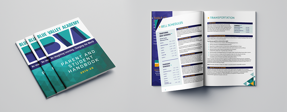
    • Student/Parent Handbook;
    • Individual Course Brochures

I developed a color code for each strand that I carried through to all marketing pieces, so that students could know immediately when looking at a class brochure which strand it belongs to: Teal for Accelerator; Green for Bioscience; Navy for Business, Technology, & Media; Blue for Engineering; Aqua for Human Services; and Purple for Medicine & Healthcare. The brochures, which used to be several pages, were shortened to one 8.5 x 11 bifold to save on printing.

Foundations of Medicine/Bioscience Brochures, Before & After Redesign
CAPS Brochure Interior, Before and After Redesign

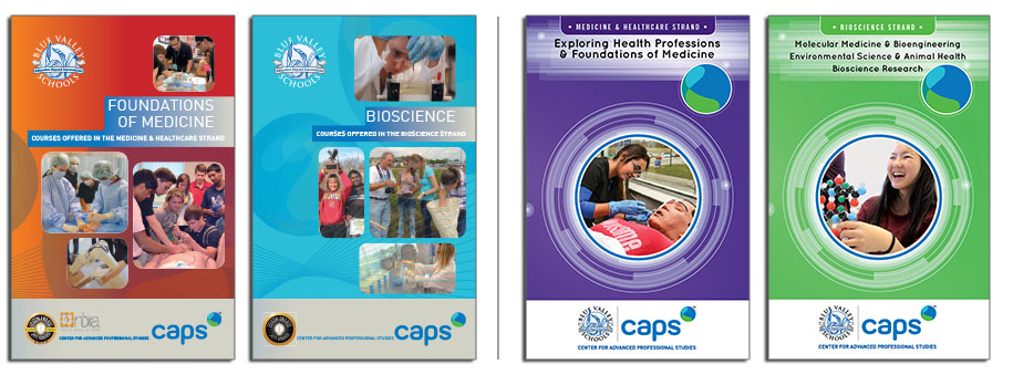
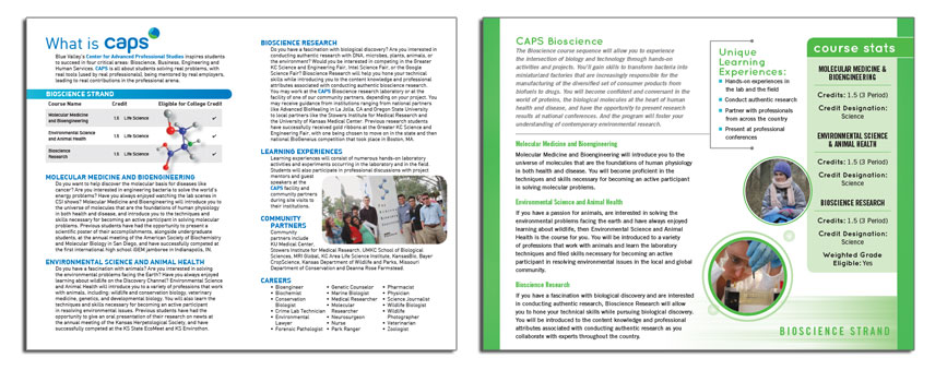
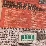
As you can see, the old class brochures used the same unattractive, tired gradients as the old folder, except, even worse, some of the color combinations were quite unfortunate and jarring to the eye. The old brochures look disorganized and corporate, when the actual program is anything but. The interior is boring. The redesign created focus by using one great image for each program, and then the interior is more brightly colored and engaging. Photos are shown in fun bubbles and the strand is clearly noted on the bottom. Important course information, such as credits, credit designations, and weighted grade eligibility are listed in a colored sidebar that draws the eye.

I was very lucky to have the opportunity to work on this project. It was great fun taking a design and applying it across such a wide range of pieces, so many that I can’t feature them all here. This was a case where the program’s collateral didn’t match the energy of the actual program – and I was honored to bring the two into alignment.

Filed Under: Case Study, Portfolio Tagged With: Bifold, Brochure, Folder, Marketing Collateral, Print, Redesign, Refresh, Signage, Trifold

Portfolio: Business-to-Business

May 28, 2015 by edspickles

Business-to-Business design is a niche that requires highly practical and goal-oriented design, but that doesn’t mean it shouldn’t be attractive. I’ve worked on trade show booths and backdrops, large banners, and van wraps – just because it’s a non-traditional format doesn’t mean it can’t look great. I also have extensive experience with PowerPoint presentations, including custom template design as well as slide design and layout; whether it’s 10 slides or 150 I can roll up my sleeves and get the job done.


The Whole Shebang
Backdrop
Banner
Booth
Custom Template
Mosquito Banner
Panels
PowerPoint
Sign
Signage
Slide Design
Slide Layout
Trade Show
Woodstream Preventing Workplace Harassment PowerPoint
IAAO Vision 2020 PowerPoint

IAAO Vision 2020 PowerPoint

Kansas City-based The International Association of Assessing Officers (IAAO) came to me needing a template designed for general presentations and a specific layout for their "2020 Vision" presentation. Using their brand colors of orange and blue as a starting point, I pulled an image of the Kansas City skyline and colorized it in their brand colors. Interior slides use an infographic-style icon scheme to illustrate individual points.
Hallier Reed Healthcare PowerPoint

Hallier Reed Healthcare PowerPoint

I both designed and did all slide layout on this presentation for Hallier Reed, an independent insurance brokerage specializing in marketing and maintenance of employer and executive benefit programs. Focusing on the Affordable Care Act, the client used this presentation to advise client employees on the rules of the healthcare law. The color scheme keeps it on-brand while the icon design adds a bit of fun.
LJAF PPT
Laura and John Arnold Foundation PowerPoint

Laura and John Arnold Foundation PowerPoint

Pryor Learning Solutions XPO Logistics PowerPoint

Pryor Learning Solutions XPO Logistics PowerPoint

Pryor Learning Solutions commissioned this PowerPoint as part of a sales pitch to XPO Logistics. The design utilized XPO's brand identity and colors, paired with the Pryor iconography and overall look.
NAVTA Virtual Trade Show Booth
NAVTA VMX Virtual Booth

NAVTA VMX Virtual Booth

VMX is a Continuing Education-based trade show for veterinary professionals. Due to the pandemic, the 2021 show was exclusively in a virtual format. I designed this booth for the National Association for Veterinary Technicians in America (NAVTA). It included four posters, a banner, a large backdrop poster, and podium signage. A detail view of the individual components can be viewed here.
Birch Communications Booth
Birch Communications Trade Show Booth

Birch Communications Trade Show Booth

This trade show signage was done for Birch Communications. The booth had multiple components: a backdrop, header, shelving unit, and a standalone barracuda banner. They requested something abstract that would complement their existing brand look, and this was the end result: a cohesive trade show backdrop that fits right in with their materials.
Pryor Learning Solutions Trade Show Banners

Pryor Learning Solutions Trade Show Banners

When Pryor Learning Solutions refreshed their identity, they needed a new trade show booth and complementary banners. This set was designed to utilize the new color story through vibrant, bold color blocking, as well as the new iconography. They looked nice together but each also worked as a standalone piece.
NAVTA Snap Pop-Up Booth

NAVTA Snap Pop-Up Booth

This flexible Snap Pop-Up Booth was created for the National Association for Veterinary Technicians in America (NAVTA). This design is lightweight, modular, and allows for use of individual components in different configurations for ease of setup. It includes a large square, two small squares, a tall banner, and a podium wrap.
SCD Booth
SCD Probiotics Trade Show Booth

SCD Probiotics Trade Show Booth

Kansas City-based company SCD Probiotics wanted a trade show booth that felt light and natural but also gave a tech vibe. I used a really lovely repeating honeycomb pattern in various blues to achieve this, and then followed up with a mosquito banner utilizing the same pattern to complement the booth.
Source Maintenance Banners

Source Maintenance Banners

These banners were created for Source Maintenance, a company specializing in corporate cleaning services. These were created to complement other marketing material updates, with a focus on unifying typography and repetition of the circle motif.
Advanstar Booth
Advanstar Booth

Advanstar Booth

This 7-panel trade show backdrop was created for Advanstar Communications. I used the modular marketing look they were using at the time to my advantage, so that booth setup would be easier and it would mask the panel seams. The white portions on the bottom are representative of a table with logo panels hanging on the front.

Filed Under: Portfolio Tagged With: Backdrops, Banners, Barracuda, Booths, Business, Exhibits, Large Format, Mosquito, Portfolio, Posters, PowerPoint, Presentations, Signage, Table Runners, Tabletop, Trade Show

Portfolio: Print & Marketing Collateral

May 28, 2015 by edspickles

For me, print is where my design career began. Over my career I’ve worked on what seems like every print project imaginable – small projects like quick-turn one-sheets, postcards, posters, bookmarks, all the way up to large projects like multi-book catalogs, cohesive marketing collateral systems, and advertising campaigns. With a highly adaptable style and the unique point-of-view of an in-house designer, no matter what the project I am the perfect partner in creating eye-catching, memorable marketing pieces.


The Whole Shebang
Advertising
Art Gallery
Badge
Book
Bookmark
Brochure
Catalog
Collateral
Conference
Coordination
Folder
Inserts
Leave Behind
Magazine
Marketing
Marketing Campaign
Packaging
Postcard
Poster
Press Kit
Print
Production
Program
Sales
Sell Sheet
T-Shirt
Trifold
NAVTA Journal
NAVTA Journal

NAVTA Journal

In the fall of 2017 I was hired to completely redesign the NAVTA Journal, a trade journal for the The National Association of Veterinary Technicians in America. I refreshed the overall typography with a friendly, rounded font for body copy paired with a very open sans-serif for headings, etc. A color-coded, tabbed design helps guide readers to desired sections. The magazine 64-pages and comes out bi-monthly.
IAAO Awards Luncheon Program

IAAO Awards Luncheon Program

I designed this program for the International Association of Assessing Officers's Conference 2018 Award Luncheon. The overall design for the conference was kind of woodsy and naturalistic, so I used this beautiful watercolor as inspiration for the program, which needed to look nice enough to be a keepsake.
Blue Valley Academy Student Handbook

Blue Valley Academy Student Handbook

When the new principal of Blue Valley Academy (BVA) came to me, he was dealing with outdated and unattractive materials. Because it is a front-facing piece that all students and parents will see, we opted to update this piece first. I started with an interim new logo design based on abstract layered shapes, to invoke the idea that BVA students take abstract ideas and turn them into something new and concrete. I stuck with the existing BVA color story but elevated it to something more modern and fun. I also designed a PowerPoint template and letterhead to complement this design.
Boelte-Hall Bartle Hall Brochure

Boelte-Hall Bartle Hall Brochure

Boelte-Hall is a Kansas printer based in the Roeland Park area. They have a partnership with Bartle Hall, a leading location for conventions in downtown Kansas City. This brochure advertises their signage services for potential exhibitors. It utilizes their recent rebranding look, with a hexagonal pattern and bright color scheme.
CAPS Course Brochure Gatefold
CAPS Course Gatefold Brochure

CAPS Course Gatefold Brochure

CAPS is a professional development program for the Blue Valley school district in Kansas. I did an initial redesign of their collateral when I first started working with them (See case study for that project here). Subsequently we simplified some of the collateral offerings and refreshed the look and feel with this design, which utilizes a lot of hand-drawn lines and abstract shapes paired with the existing iconography to keep the through-line of the original design. This design was iterated across all collateral.
Pryor Learning Solutions e-Learning Trifold

Pryor Learning Solutions e-Learning Trifold

I designed this trifold brochure for Pryor Learning Solutions. It's designed to promote the company's e-learning options, utilizing their recent brand update. Bold color blocks in their brand color story move the reader's eye to the most relevant information, with a clean design that makes it easy to digest. The brochure also include the Pryor custom-designed (by me) iconography.
IAAO Las Vegas Conference Program
IAAO Las Vegas 2017 Conference Program

IAAO Las Vegas 2017 Conference Program

I designed this program for the International Association of Assessing Officers 2017 Conference, which took place in Las Vegas. The design is bright and clean, with colorful informational boxes and icons to draw readers' eyes and increase the usability of the program, which was much smaller, yet bulkier last year. The program also features a stitched-in center fold-out panel with the various maps conference attendees would need to navigate to the various conference events.
Time Home Entertainment, Inc. Book Catalogs

Time Home Entertainment, Inc. Book Catalogs

The biannual catalog for Time Home Entertainment, Inc./Oxmoor House features both new releases and a fairly lengthy backlist. For 2014, the catalog was redesigned to utilize the previous color scheme but a more compact layout that still gave generous space to point out special features for each title. This project took approximately six weeks from initial design to press files.
The Snarf Scarf Packaging

The Snarf Scarf Packaging

The Snarf Scarf is a handmade protective scarf that helps keep clothes clean from spills. There are scarfs for adults and children. While the logo was already designed, I designed a unique mark to complement that, and then designed packaging for both the adult and child versions. The adult sleeve is clean and modern, while the child one is more fun and whimsical, but they all complement one another.
Kansas International Film Festival Marketing Collateral

Kansas International Film Festival Marketing Collateral

Starting with the unique and graphic Kansas International Film Festival logo, I designed the 2010 poster to zoom in and really make the most of the stark shapes and colors in the identity. I then utilized the poster theme across all other collateral for the show, including t-shirt, festival passes, and the festival program.
Andrews McMeel Publishing Book Catalogs

Andrews McMeel Publishing Book Catalogs

At the time I worked on this project, Andrews McMeel Publishing put out catalogs featuring new products three times a year — Spring, Summer, and Fall. Each season had several catalogs — Frontlist, Cookbook, Childrens, Gift, etc — all following the same design style. I worked on this project for over five years and it involved a lot of content management, quick work, and production know-how.
Time Home Entertainment, Inc. Sell Sheets

Time Home Entertainment, Inc. Sell Sheets

I often create quick-turn sell sheets for Time Home Entertainment, Inc.'s sales department. These sometimes promote a particular title or sales offer, etc. I design each one to complement the aesthetic of the books it is featuring, or to fit perfectly with the look of the catalog if the offer features a more diverse range of titles.
The Great Cook Ads
The Great Cook Print Ads

The Great Cook Print Ads

These print ads were designed for the Spring 2015 title The Great Cook. The client wanted something simple and sophisticated and supplied several image options. Each ad size required thinking of the design in a different way.
Andrews McMeel Publishing Pembroke Program Ads

Andrews McMeel Publishing Pembroke Program Ads

The Pembroke Hill Playbill, which is distributed at all performing and visual arts events throughout the school year, raises income to fund children's arts programs throughout the year. This series of ads was placed by Andrews McMeel Universal and features the cartoons published by this company as both syndicated features and books. I wanted to emphasize the fun of the art but I needed to look at it in a new way every year. I think each ad stands on its own as a design but they all work together as a series as well.
Indigo Wild Sell Sheets

Indigo Wild Sell Sheets

Kansas City company Indigo Wild has a very distinctive and fun design aesthetic, but it is one that has grown and transformed in the six years I've been working with them. This is a selection of sell sheets from the last six years. The designs have gone from quirky and hand-drawn to a sexier, more streamlined look. As always I design my sell sheets to complement the existing aesthetic of the company, so these have been fun to tackle over the years.
EUTWC Ad
Eating Up the West Coast Print Ad / Postcard

Eating Up the West Coast Print Ad / Postcard

This ad was created for Time Home Entertainment Inc for the spring 2015 book Eating Up the West Coast. It ran in Sunset magazine. The book is a kind of cookbook/travelogue based on a popular blog, so I chose to feature images of the author, who is a main selling point here, combined with a travel photo, a restaurant pic, and a food photo. The book design was really fun so I pulled several of those elements out to keep things light. To me this ad really encapsulates everything the book has to offer. I also designed a complementary promotional postcard for this title.
NextPage Independence Day Postcards

NextPage Independence Day Postcards

NextPage is a company offering a wide range of print services. For major holidays, they produce a series of promotional packages that they sell to car dealers. They came to be with a request for three Fourth of July "high end" postcard designs that were then extrapolated into handouts and web banner ads. I think these are fresh and modern looking but still hit the Independence Day notes.
America's Best BBQ Press Kit

America's Best BBQ Press Kit

America's Best BBQ was written by Kansas City BBQ Grillmasters and published by a Kansas City publisher, so the press kit really needed to shine. I was lucky to have a really great book design to jump off of. I started with the a folder, which is the "menu", and the kit contains five pieces of collateral and a foldover bookmark. A wet nap sourced very cheaply from Amazon.com adds a fun touch that makes the kit really memorable. I've done a lot of press kits over the years, but this is really one of my all time favorites.

Filed Under: Portfolio Tagged With: Advertisement, Advertising, Booklets, Bookmarks, Brochures, Catalogs, Cohesive Marketing, Folders, Magazines, Marketing Collateral, Postcards, Posters, Print, Trifolds

Portfolio: Websites and eMarketing

May 28, 2015 by edspickles

Web design has come a long way in a short time – and I’m always learning new technology to keep up. I specialize in WordPress websites built on the Genesis Framework – a system that gives clients flexibility and control over their site. My web know-how extends to web marketing, including HTML e-mails, banner ads in all sizes and variations, cover photos, etc.


The Whole Shebang
Advertising
Banner Ad
Banner Ads
Custom
E-mail
Email
Genesis
HTML
Twitter Badge
Web Ad
Website
Wordpress
eBlast
eMarketing
The CVC Website
The CVC Website

The CVC Website

The CVC is a veterinary conference that happens three times a year in various cities around the U.S. Their old website was a tangled mess that was impossible for users to navigate. I started at square one and built this site from the ground up using the Genesis Framework on the Wordpress CMS. The site is clean, adheres to the existing CVC brand, and is easy to update as shows open for registration. The site also features highly searchable grids of all content for each show.
Railway Service Contractors Website

Railway Service Contractors Website

Railway Service Contractors is a small business that offers a range of services to the locomotive industry. Their site was designed to put the locomotives front and center.

railwayservicecontractors.com
Deborah Broide Publicity Website

Deborah Broide Publicity Website

The client, Deborah Broide Publicity, requested a website that reflected the simplicity of her logo. The result was a lovely, clean website that complements her business's existing aesthetic.

http://deborahbroidepublicity.com
Prairie Pediatric Dentistry Website

Prairie Pediatric Dentistry Website

Prairie Pediatric Dentistry needed a website that was professional, but still fun and approachable. Using the logo I designed as a starting point, the website has a calm, neutral color palette but with fun details like a crayon-style wavy line along the footer. This site was built on the Genesis framework for Wordpress.

ppdkansas.com
Synergie, LLC Website

Synergie, LLC Website

Synergie, LLC is a consulting company specializing in veterinary practice. Given only the logo, I was tasked with creating a clean, easy-to-navigate site that highlights immediately the specific services the company offers. I chose to use the blues of the logo as a jumping off point to create this airy, simple site, which was built on the Genesis Framework using the Wordpress CMS.

www.synergie-llc.com
TallulahBelle's eMarketing Template
TallulahBelle's HTML Email Template

TallulahBelle's HTML Email Template

TallulahBelle's is a Leawood, Kansas boutique specializing in handcrafted art, sculpture, jewelry, and accessories from artists around the country. The owner has a generally cohesive marketing look, but her emails stuck out as clunky and unattractive. I designed an email template to better fit into her overall aesthetic, with a navigation to her site, large splash image, and modules to help promote various messages each month.
Pressure Cooking Made Simple eBlast

Pressure Cooking Made Simple eBlast

Pressure Cooking Made Simple was released in Spring 2015 with a coordinated marketing campaign that included this eBlast, which goes to all Cooking Light Magazine's e-mail subscribers. The design is a cleaner version of the book interior with a lovely, eye-catching food photo that makes recipients want to start cooking.
Beach House Happy eBlast

Beach House Happy eBlast

Beach House Happy was released in Spring 2015 with a coordinated marketing campaign that included this eBlast, which goes to all Coastal Living e-mail subscribers. It's nice and simple, with a gorgeous interior photo and watercolor accents to add texture.
Mad Delicious eMarketing

Mad Delicious eMarketing

Mad Delicious (which has since won a James Beard Award) was released in Fall 2014 with a coordinated marketing campaign that included print ads (which I also worked on) and a variety of eMarketing projects, including an eBlast, Twitter Badge, and both static and rotating banner ads in a variety of sizes.
VPI Banner Ads
VPI Banner Ads

VPI Banner Ads

Every year, Veterinary Pet Insurance (VPI) hosts a Practice Manager of the Year contest and reception at the CVC veterinary conference. For 2015, I proposed using a "Super Dog" theme to go with their "Tell Us How Your Manager's SUPER" marketing copy. After finding (or creating) the proper photos, I designed the ads and other marketing collateral to have a bright, graphic, comic book-inspired look. This one of the most fun projects I've worked on. And, the client liked the concept so much they used it in promotion of their other products!
The CVC Banner Ads
The CVC Banner Ads

The CVC Banner Ads

Every year, veterinary conference The CVC runs a variety of banner ads to promote the show to potential attendees and exhibitors. I handled creating these ads for several years. The project would entail three standard banner ad sizes designed as both rotating and static, which promoted a variety of messages to different audiences, which routinely added up to over 40 ad variations.

Filed Under: Portfolio Tagged With: Advertising, Banner Ads, CMS, e-Blasts, e-Marketing, HTML Emails, Portfolio, Websites, Wordpress

Portfolio – Logos & Complete Identity Packages

May 28, 2015 by edspickles

Crafting an identity is one of the most intimidating things for new business owners. With so many cheap, fly-by-night websites offering fast and easy (and often plagiarized) logos, why work with a designer? Because in the end, you get what you pay for, and the identity of your business, which is the first thing potential customers see, is not the place to skimp – your logo is the first foundational brick in the overall image of your business and it needs to be strong and capable. I take pride in asking the right questions to create the perfect logo that communicates all the right things, and then taking that newly created brand and building a sturdy, functional, and eye-catching identity system around it.


The Whole Shebang
Logo
Brand
Identity
Business Cards
Letterhead
Church
Fundraising
Convention
Veterinary
Non-Profit
Lawyer
Law Firm
T-Shirts
Sign
Signage
Packaging
Labels
Postcard
Website
Marketing
Collateral
Update
Refresh
Menu
Restaurant
Train
ACA Angel University

ACA Angel University

I created this logo for Angel Capital Association, a trade association for angel investors, to brand their education series. This branding is used both independently and tied in with their annual conference, the Summit. The brand invokes learning, with simple illustrations of books, placement of the books also represents bars on a bar graph, with upward growth indicating the growth of investments.
Prestige Transportation, LLC Brand Identity
Prestige Transportation, LLC Identity

Prestige Transportation, LLC Identity

Prestige Transportation, LLC is a Kansas City-based company offering reliable and accessible high-end transportation services. The client wanted to first and foremost communicate class, so I designed this balancing the modern with the traditional, to be really graphic but still elegant. The business cards were printed on extra thick uncoated black stock with a beautiful mirror-shiny silver foil on the logo side.
IAAO Conference & Exhibitions

IAAO Conference & Exhibitions

I create a yearly logo for the International Association of Assessing Officer's (IAAO) yearly conference. The design brief is that the logo needs to invoke the city in which it's being held, and also it needs to be a seal- or badge-like design so it's easy to use across many mediums.
Veterinary Nursing Initiative
Veterinary Nursing Initiative Logo

Veterinary Nursing Initiative Logo

This logo was created for the Veterinary Nurse Initiative, which seeks to create a national "Registered Veterinary Nurse" credential to replace the various different Veterinary Technician credentials used throughout the country. The new title also codifies the unique role these professionals play in a veterinary practice. To that end, I designed this logo to invoke the professional partnership that leads to better outcomes for patients. The red cross represents the foundational role Veterinary Nurses play and the teal cross is the Veterinarian. The patient is protected between the two of them, and the two crosses create a stairstep up, symbolizing success. The design is crisp, clean, and professional and will help support the National Association of Veterinary Technicians as they pursue legislation to nationalize the Veterinary Nurse credential.

To learn more about this Initiative here.
Prairie Pediatric Dentistry
Prairie Pediatric Dentistry Identity

Prairie Pediatric Dentistry Identity

Prairie Pediatric Dentistry is a Lenexa, KS-based dental office serving children from ages 1 to 18. The client requested something clean and professional looking and was attracted to designs with curved lines. I created this custom wheat illustration in a style that invoked a child's drawing, and selected an easy-to-read, yet approachable font to create a welcoming feel to the identity. The blue, green, and gold color scheme were applied throuough the other materials, and I used the wheat illustration as an additional design detail on the referral pad.
Jews for Animals
Jews for Animals Logo

Jews for Animals Logo

This logo was created for a group called Jews for Animals, an initiative from The Shamayim V'Aretz Institute. This organization focuses on the humane and ethical treatment of farm animals. They wanted a design that was clean and simple, so I created custom animal illustrations and then placed them within a circle that mimics the design of their existing logo, so that they can work harmoniously together. There are both horizontal and stacked versions of the logo for different applications.
Bushyhead, LLC Attorneys & Advisors Brand Identity
Bushyhead, LLC Attorneys & Advisors Identity

Bushyhead, LLC Attorneys & Advisors Brand Identity

Bushyhead, LLC, Attorneys & Advisors is a small law firm based in Lee's Summit, MO. Because the firm has a focus on real estate law (their tagline is "Building Community"), I designed an abstracted, geometric city skyline paired with a slender, modern wordmark. The owner's favorite color is purple so I balanced that out with a nice grayish taupe tone to be colorful but still professional.
Nasteff & Quinn
Nasteff & Quinn Attorneys & Advisors Identity

Nasteff & Quinn Attorneys & Advisors Identity

The attorneys of Nasteff & Quinn, who had previously been members of a different firm together, wanted something that was similar in style from their old firm's logo but that still stood on its own. I designed the mark to feel strong and grounded, but with an approachable, traditional ampersand to pull the initials together. The traditional but approachable serif font builds on the messages communicated by the mark. The three-color scheme feels modern but is also slightly muted and grounded, with the blue complementing the maroon and green nicely. I designed complementary business cards and letterhead to round out the identity.
Pet Nutrition Alliance Identity

Pet Nutrition Alliance Identity

Pet Nutrition Alliance is an organization whose mission is to position nutrition as essential to optimal pet health by providing resources to veterinary healthcare teams. They came to me wanting a more appealing logo for use in consumer-facing applications. The resulting design needed to be eye-catching and fun, and I think that brief was fulfilled. This logo is memorable and whimsical, but balanced by a professional, no-frills typography. I also designed complementary icons for use on their website.
Little Pumpkins
Little Pumpkins Identity

Little Pumpkins Identity

Little Pumpkins, LLC, a company specializing in organic baby foods, came to me needing a clean and modern logo that still invoked the fun of babies. I illustrated this little guy and picked a fun bright green, orange, and brown color scheme. In addition to the logo I designed business cards, food labels, postcards, table signage, and a website.
Kodi's Cakes
Kodi's Cakes Identity

Kodi's Cakes Identity

Kodi's Cakes is a small custom cakes business. The client wanted something clean and sophisticated while invoking the charm of an old-fashioned bakery, and I think this logo succeeds, while reflecting the personal style of the bakery's owner. I also designed a business card and a really fun website for this client.
James Walker Law
James Dean Walker Law Identity

James Dean Walker Law Identity

James Walker came to me requesting a "hip" logo that he could proudly display on the door of his new offices, located in a downtown building adjoining the Screenland Theatre. This logo and accompanying business card and letterhead was the result - clean and modern, but not overblown.
KC Restoration
KC Restoration Identity

KC Restoration Identity

Sometimes, a client has a logo they like but it wasn't well executed. KC Restoration, LLC hired me to take their existing logo, which was overly complex and difficult to read at small sizes, and clean it up. The new version is brighter and crisper, and is much easier to use in a variety of applications. I then designed complementary business cards, letterhead, and collateral to utilize the new look across all pieces.
Brazill's on Main
Brazill's on Main Identity

Brazill's on Main Identity

Brazill's on Main is an upscale casual restaurant located in a conservative county of New York. The interior is a really lovely brick, so I used that as a jumping-off point, pairing it with a saturated black. The serif font of "Brazill's" is conservative, but the script of "On Main" balances it out with an easy casual vibe. The menus are professionally printed but the beer lists and other items have been designed with a white border for easy in-house printing.
Train Logos
Garden Railyway Show Logos

Garden Railyway Show Logos

This series of logos was designed for a client who organizes conventions for model train and garden railway aficionados. Each is a nice distillation of the locale rendered in a clean, graphic illustrative style.
Various Logos 1
Various Logos: Clean, Feminine Style

Various Logos: Urban Simplicity, Caroline's Embroidery, and Country Club Plaza Apartments

This serious of logos is for a wide range of businesses - an interior design firm, a custom embroidery business, and an apartment complex - but they all are great examples of a clean, somewhat feminine logo style.
Various Logos 2
Various Logos: Modern & Professional

Various Logos: AdminJack, MJ's Lessons from Home, Reinvent1, and Rejuve-Nation

This serious of logos is for a wide range of businesses - a freelance administration specialist, a home-cooking teacher, a sports consultant, and a career-coaching service - but they all represent a very graphic, clean style.
Various Logos 3
Various Logos: Eyecatching Illustrations

Various Logos: TacticallyShop.com, 4GreenPaws.com, Cheerful Vintage, The 8-11 Club

This serious of logos is for a wide range of businesses - a military gear website, a pet supply website, a vintage goods shop, and a business club - but they all represent my graphic, clean logo design aesthetic.

Filed Under: Portfolio Tagged With: Branding, Business Cards, Collateral, Identity, Letterhead, Logos

Visit My Portfolio

  • Branding & Identity
  • Websites and Digital Advertising
  • Print: Catalogs, Brochures, Flyers, and More
  • Business-to-Business: Trade Show Booths, Signage, and PowerPoint Design
  • Iconography & Infographics

Contact Me

 mmiller@popdesigned.com
 816-809-1993

Explore the Design

  • Home
  • Portfolio
  • About
  • Contact

Copyright © 2025 , Pop! Creative Design. All rights reserved. Reproduction in whole or in part is prohibited.